Sr.UI/UX Designer – Tung Lam

menu icon
Logo
Available for work
Hanoi, Vietnam 🇻🇳
Case Study · 2024 · UX Research · UI Design · Website Redesign
Website
HC Vietnam

A full-scale website redesign — from auditing the old site, researching B2B/B2C user behaviour, to building a complete Design System and 13+ polished pages with bilingual VI/EN support.

UX Research & AuditCompetitor AnalysisCustomer PersonaInformation ArchitectureDesign SystemComponent Library · 20 pcsResponsive · 3 BreakpointsBilingual VI / ENB2B · B2CSEO Optimised
13 → 90+
PageSpeed Score
Mobile performance
13+
Pages redesigned
Desktop & Mobile
20
UI Components
in Design System
VI · EN
Bilingual support
for global reach
Live at hcvietnam.com.vn
02 / Website Audit

What was wrong with the old site

Evaluated against Nielsen's 10 usability heuristics and WCAG standards. Three critical areas failed to meet expectations.

Before redesign Mobile performance scored 13/100. Design lacked consistency, brand messaging was unclear — poor conversion and high bounce rates.
🌐 hcvietnam.com.vn — Before redesign
Old site
HC Vietnam old website
Inconsistent buttons3+ typefacesCovid-19 banner outdatedContrast 2.25 — fails WCAGUnprofessional cutoutsContact widget blocks contentPageSpeed 13/100No social proof
Design & Interface
Inconsistency & poor aesthetics
  • Buttons varied in colour, size, and shape — no consistent system
  • More than 3 different typefaces used simultaneously
  • Hero banners used poorly composed stock photo cutouts
  • Product images not consistently background-removed
  • Colour contrast failed WCAG AA: ratios of 2.25 and 2.95
  • Floating contact widget blocked content on mobile
Content & Performance
Outdated content & slow load
  • Hero banner still featured Covid-19 messaging — severely outdated
  • Generic stock imagery — weak brand expression throughout
  • Testimonials lacked social proof (no avatars, no platform)
  • Brand message not clearly communicated
  • No video or motion — minimal storytelling capability
  • SEO score 61/100 — significant missed organic opportunity
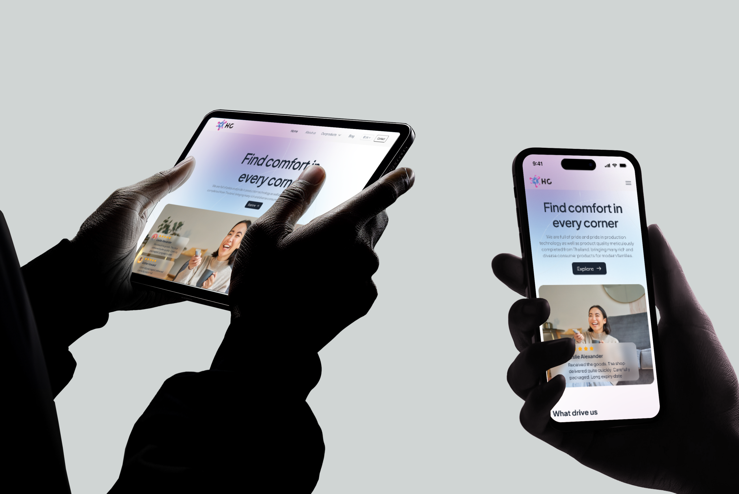
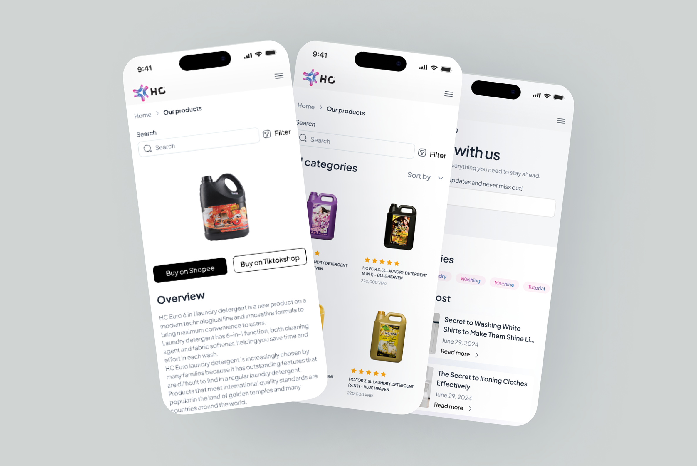
Google PageSpeed Insights — Before Redesign
13
Performance
Mobile
79
Accessibility
89
Best Practices
61
SEO
02B / Opportunities

Four design objectives

Every design decision traces back to one of these four goals — from layout choices to component behaviour.

Goal 01 · Story-telling
Emotionally expressive visual language

Use authentic photography, lifestyle imagery, and embedded TikTok/video content to tell the HC brand story — showing how the product improves everyday family life, not just listing features.

Lifestyle photographyVideo integrationSocial feed
Goal 02 · Smooth experience
Responsive, fast, frictionless

Design mobile-first across 3 breakpoints. Optimise image formats, lazy loading, and eliminate render-blocking resources. Target PageSpeed 90+ on mobile.

Mobile-firstPageSpeed 90+3 Breakpoints
Goal 03 · Minimal design
Flat design minimalism with brand identity

One typeface (Plus Jakarta Sans), a structured Design System, and a restrained 2-colour brand palette. Generous white space and consistent components create trust.

Design SystemSingle typefaceWhite space
Goal 04 · Conversion
Serve both B2B and B2C journeys

CTAs always visible. Product pages link directly to Shopee and TikTokShop. B2B content prominently featured. Bilingual VI/EN expands reach to international partners.

Persistent CTAB2B + B2CVI · EN
03 / Competitor Analysis

How HC compares to competitors

Four competitors audited — THT Vietnam, Attack (Kao), Hygiene Asia, and Unilever Vietnam — to identify market gaps, best practices, and design patterns to adopt or avoid.

🧴
THT Vietnam
thtvietnam.com.vn — Direct competitor
What they do well
  • Brand colours used consistently across entire site
  • Banner and image design cohesive in style and palette
  • Good mobile — fast load, large readable banners
  • Clear product categorisation with visual nav
Weaknesses
  • Design language feels dated — lacks modern minimalist aesthetic
  • No bilingual support — limits B2B reach
  • Product pages lack social proof and conversion CTAs
Lesson: Colour consistency works — but design modernisation and bilingual content are unaddressed opportunities.
Attack · Kao Vietnam
kao.com/vn — International brand
What they do well
  • Clean, minimalist design — easy to navigate
  • Content clearly reflects brand philosophy: "Making Life Beautiful"
  • Strong editorial structure — brand story front and centre
  • International design standards and typography
Weaknesses
  • No distinctive brand identity — feels generic
  • Product pages lack direct purchase links (Shopee, TikTokShop)
  • Weak social proof — no reviews, no community
Lesson: Minimal design works — but direct purchase CTAs and community content are entirely missing.
🫧
Hygiene Asia
hygiene.asia — E-commerce focused
What they do well
  • Direct e-commerce model with on-site selling
  • Detailed product descriptions with usage instructions
  • Prominent promotions and discount codes
  • Multiple product variants clearly shown
Weaknesses
  • Inconsistent icon and image visual language — reduces trust
  • Cluttered layout — too many competing elements
  • Lacks brand storytelling — purely transactional feel
  • Mobile experience fragmented and slow
Lesson: Detailed product info is effective — but a clean design system is essential for brand credibility.
🌐
Unilever Vietnam
unilever.com.vn — Global reference
What they do well
  • Distinctive, memorable design — strong brand identity
  • Brand values and mission communicated visually
  • Impressive numbers: 35M products, 29 years, Top 1 employer
  • Sustainability sections reinforce trust
Weaknesses
  • Corporate tone — less accessible for everyday consumer
  • Navigation complexity — too many top-level sections
Lesson: Leading with brand story and achievements builds deep trust — HC should adopt this approach at a more accessible scale.
CriteriaHC VietnamTHT VietnamKao/AttackHygiene AsiaUnilever VN
Design consistency
Brand storytelling
Mobile experience
Direct purchase CTA
Social proof
Bilingual support
03B / Key Learnings

Design opportunities identified

Opportunity 01
Native purchase CTAs on product pages

No competitor fully integrates direct Shopee and TikTokShop links. HC Vietnam can own this — making purchase frictionless for Vietnamese consumers who shop on these platforms daily.

Opportunity 02
Community-driven social proof at scale

Embedding a live TikTok community feed, verified reviews, and UGC on the homepage creates trust signals no domestic competitor currently provides.

Opportunity 03
Bilingual interface for B2B expansion

Only international brands offer bilingual content. HC Vietnam can stand out among domestic brands — positioning itself as a credible partner for international distributors.

04 / Customer Persona

Who HC Vietnam designs for

Two primary user segments with distinct goals, pain points, and decision-making patterns — both served by one cohesive interface.

81%
Young women reach brands
via social media (EY study)
User segments
B2B distributor · B2C consumer
#1
Female purchase factor:
social proof & emotional fit
B2+B2
Both journeys served
by a single interface
B2C · Individual Consumer
LT
Linh Trang
Homemaker · 28 yrs · Ho Chi Minh City
"I want products that actually work and that I can trust — I buy whatever my friends recommend on TikTok."
Income
8–15M VND / month
Device
iPhone · Mobile first
Shops via
Shopee · TikTokShop
Lifestyle
Family-centred, social active
Goals
  • Find cleaning products safe for family and children
  • Best value — good quality at reasonable price
  • Discover products through trusted social endorsements
  • Buy conveniently on her preferred platforms
Pain points
  • Doesn't trust testimonials without social context
  • Frustrated by slow websites and complicated checkouts
  • Overwhelmed by feature-heavy product descriptions
  • Distrustful of brands without real customer content
Design implication
Lead with emotional storytelling, not specs. Embed TikTok community content and verified reviews. Make "Buy on Shopee" the most prominent action on product pages.
B2B · Business Distributor
MH
Minh Hải
Regional Distributor · 38 yrs · Hanoi
"Before I commit to a supplier, I need to see their market reach, quality standards, and whether they support their partners."
Company
Small–mid distributor
Device
Desktop · thorough researcher
Sells via
Retail chains, wet markets
Priority
Margin, reliability, brand equity
Goals
  • Source products that sell quickly and generate good margin
  • Partner with a reputable brand that supports growth
  • Understand pricing, MOQ, and distribution policies upfront
  • Evaluate brand's marketing investment and consumer demand
Pain points
  • Hard to evaluate credibility without transparent data
  • Can't find clear B2B contact or partnership path
  • No visibility into distribution network coverage
  • No English content — limits cross-border sourcing evaluation
Design implication
Prominently feature scale metrics (3.2K sales, 200+ distributors). Create a dedicated "Partner with us" CTA. Include distribution map and brand history timeline.
04B / B2C Journey

How Linh Trang discovers & buys

📱
Discover
Sees product on TikTok or friend's recommendation
TikTok · Facebook
🔍
Research
Visits website to verify legitimacy and read reviews
Website · Google
Evaluate
Checks ratings, social proof, and product benefits
Product page
🛒
Purchase
Clicks "Buy on Shopee" or "TikTokShop" CTA
Shopee · TikTokShop
💬
Advocate
Shares review on social, joins HC community
TikTok · Zalo
04C / B2B Journey

How Minh Hải evaluates a supplier

🌐
Search
Finds HC Vietnam via Google or trade network referral
Google · SEO
🏢
Assess brand
Reviews About page — scale, years, distribution
About Us page
📦
Browse products
Reviews catalogue, pricing, variants, and sales
Product pages
📋
Verify
Looks for quality certifications and case studies
About · Blog
📬
Contact
Fills B2B contact form or calls hotline
Contact page
05 / Solution — Mockups

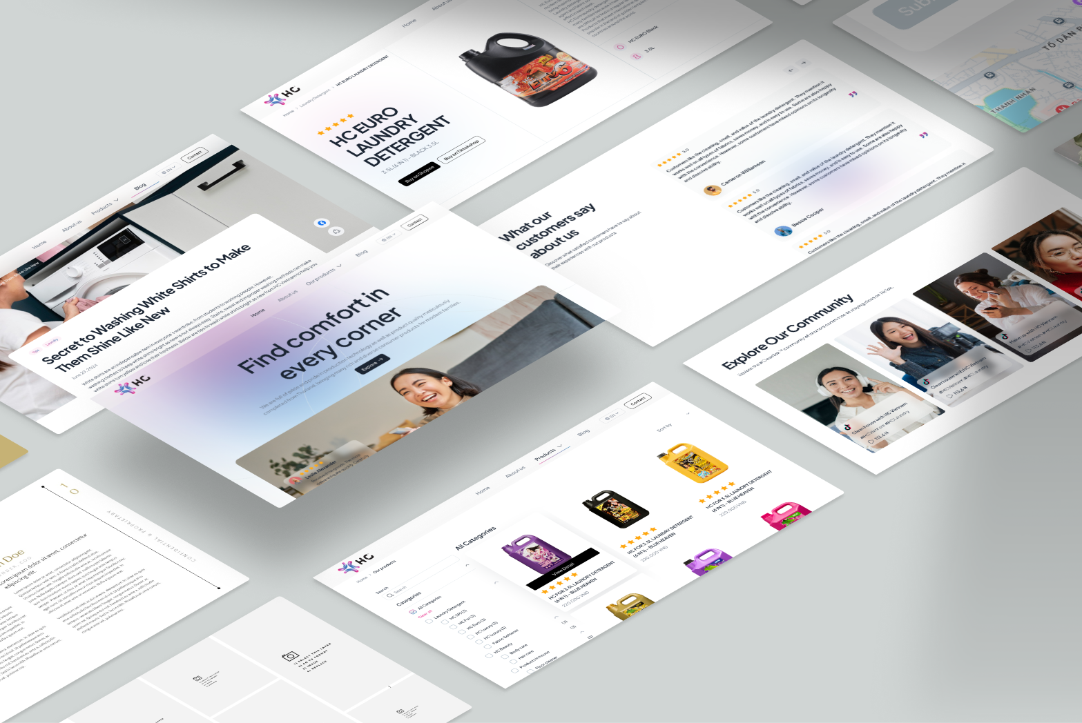
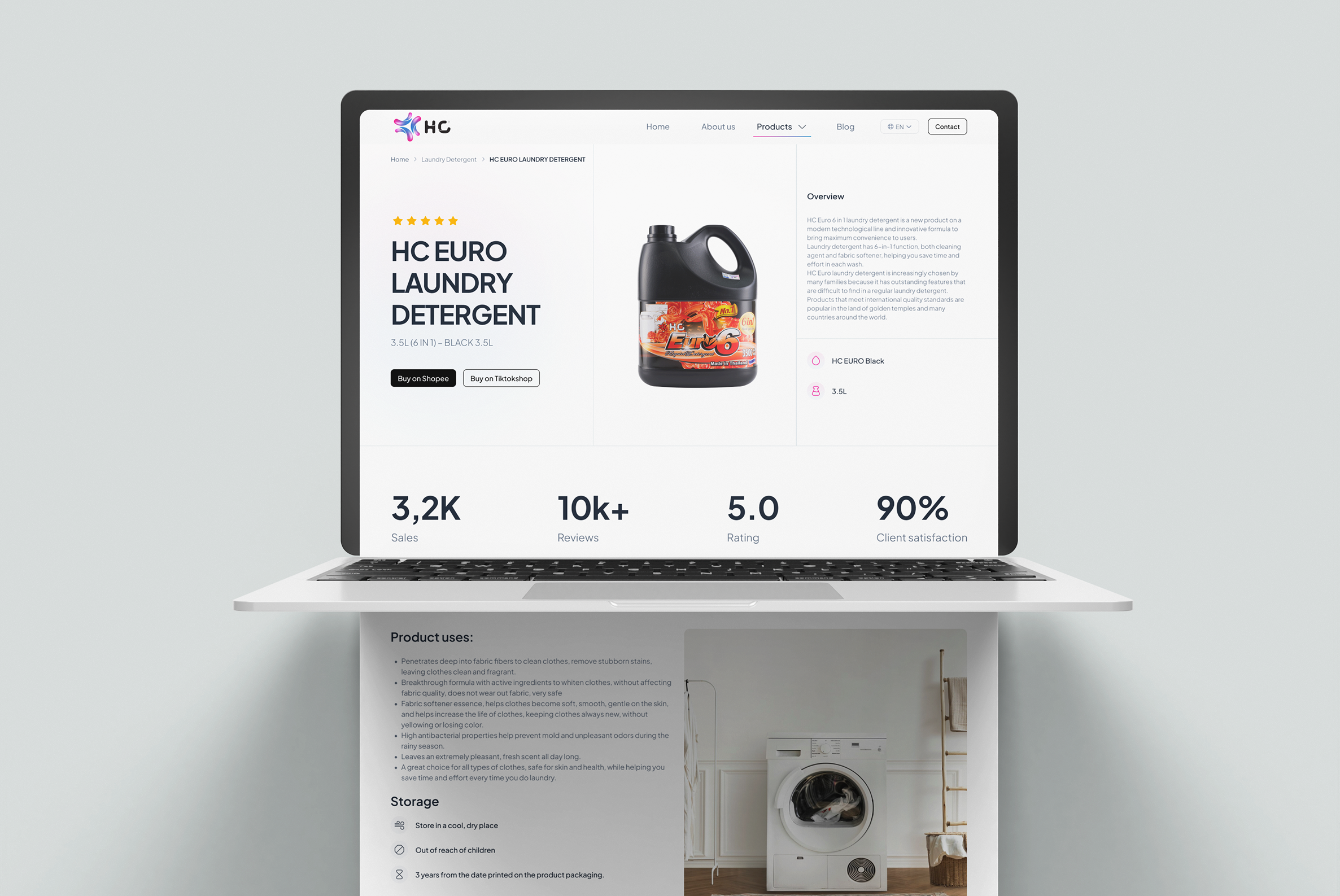
Final design — all screens

Desktop and mobile UI across 7 pages — Homepage, Product List, Product Detail, About Us, Contact, Blog List, and Blog Detail.

Mockup 01
Mockup 02
Mockup 03
Mockup 04
08 / Outcome

Before & after — measurable impact

Quantified improvements across performance, design quality, and conversion readiness — with the website now live at hcvietnam.com.vn.

↑ 7× better
90+
PageSpeed Score
from 13 → 90+
↑ Redesigned
7+
Pages designed
across 3 breakpoints
✦ New
20
UI Components
in Design System
✦ Expanded
VI·EN
Full bilingual
for global reach
BeforeOld WordPress site
PageSpeed Mobile13/100
SEO Score61/100
Design consistencyInconsistent
CTA visibilityHidden / buried
Social proofNone
Language supportVI only
Purchase integrationNot integrated
Design SystemNone
Afterhcvietnam.com.vn — Redesign
PageSpeed Mobile90+ / 100
SEO Score90+ / 100
Design consistencyFull Design System
CTA visibilityAlways visible
Social proofTikTok + Reviews
Language supportVI · EN
Purchase integrationShopee + TikTokShop
Design System20 components
Now live
HC Vietnam
hcvietnam.com.vn
Visit live site