Designing an NFT marketplace that bridges mainstream SEA consumers with blockchain-powered brand rewards — from fashion drops to game studios.
Metagetx was conceived as Asia's first NFT Rewards Marketplace — connecting users with digital assets from brands, content creators, and game studios across Southeast Asia.
The core vision was to democratize NFT ownership by tying it to real-world value: brand loyalty programs, exclusive event access, and collectible rewards.
Existing NFT platforms are built for crypto-native users — they assume wallet knowledge, are overwhelmed with speculative content, and lack the trust signals needed for mainstream adoption.
Setup requiring MetaMask, seed phrases, and ETH gas fees deterred 7 in 10 first-time visitors from ever completing a purchase.
Existing platforms prioritize speculative art collectibles over utility-driven NFTs — misaligned with SEA consumers' reward-focused motivations.
Users reported hesitation about scams, unverified creators, and unclear ownership rights — all solvable UX and content problems.
The primary blocker was not price, but complexity — wallets, seed phrases, and gas fees created invisible drop-off before first purchase.
Users trusted NFTs more when attached to recognizable brands — fashion, sports, music — rather than anonymous digital artists.
Target users in SEA discovered and transacted primarily on mobile. Desktop was a secondary, research-only surface.
Leaderboards, reward streaks, and exclusive event access were compelling motivators — more so than resale value potential.
Users were comfortable with USD$25–$50 purchases when tied to brand rewards — unlike the volatile crypto-art market.
Platform credibility came from creator verification, brand partnerships, and clear ownership policies — not blockchain transparency.
SEA users don't resist NFTs because of price or technology — they resist because of complexity and lack of relevance. Simplify the entry, add familiar brand context, and conversion increases dramatically.
No existing platform combined simplified onboarding, brand partnership infrastructure, and a rewards-first value proposition for the SEA market. This white space became Metagetx's core positioning — not competing on crypto feature depth, but on accessibility and brand relevance.
Marketing executive who follows K-pop artists and fashion brands on Instagram. Curious about NFTs but intimidated by crypto wallets. Shops via mobile apps and trusts brand recommendations.
Software developer who plays mobile games daily and already owns some crypto. Wants NFTs that offer real in-game utility or event access. Has tried OpenSea but finds it overwhelming.
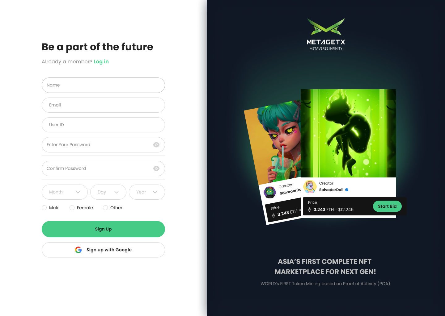
A custodial wallet is created in the background on email sign-up — no MetaMask, no seed phrase. Users encounter wallet concepts only when they choose to withdraw, reducing first-session drop-off dramatically.
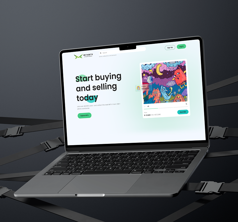
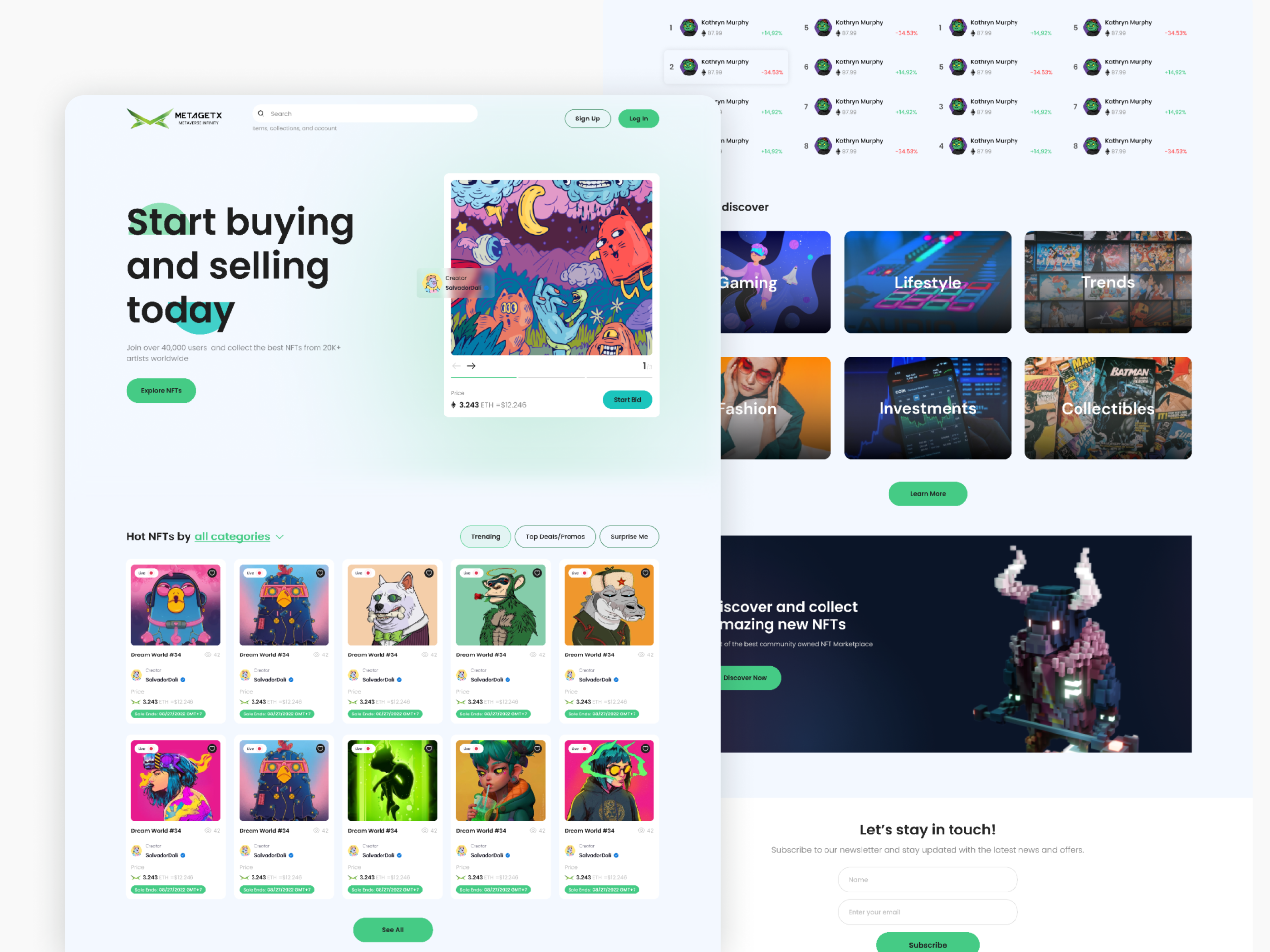
The homepage leads with trending NFTs and brand-curated categories — Lifestyle, Fashion, Games, Collectibles — rather than generic blockchain asset listings. A Hot NFTs section, Top Sellers leaderboard, and upcoming event drops create a sense of live activity and community momentum from the first scroll.
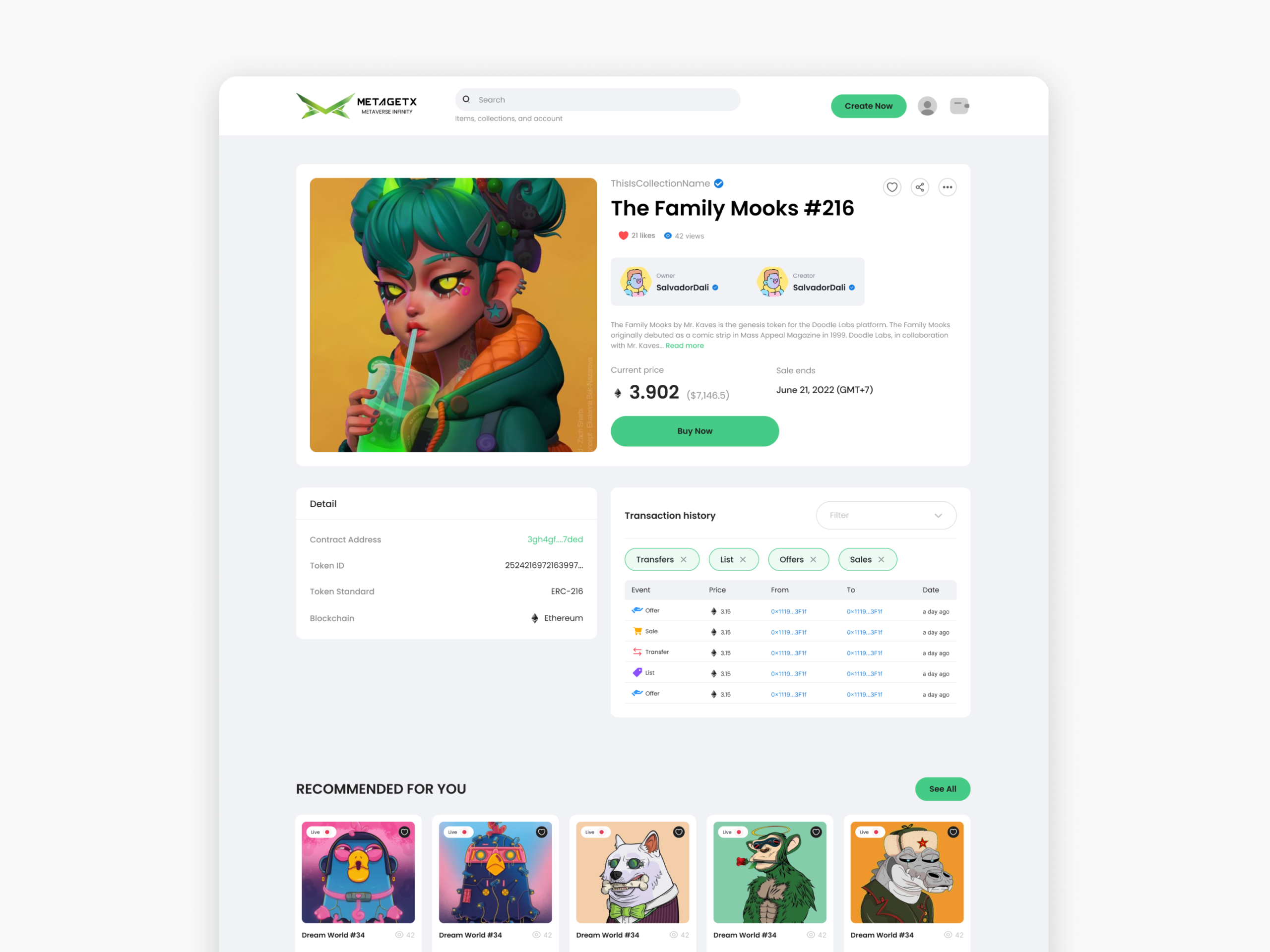
The NFT detail page displays USD pricing as the primary value with METGX token shown as secondary — removing the price anxiety that crypto-only marketplaces create. Transaction history, creator verification, item attributes, and a "Recommended for You" section are all surfaced clearly, giving buyers the confidence to complete a purchase without leaving the page.
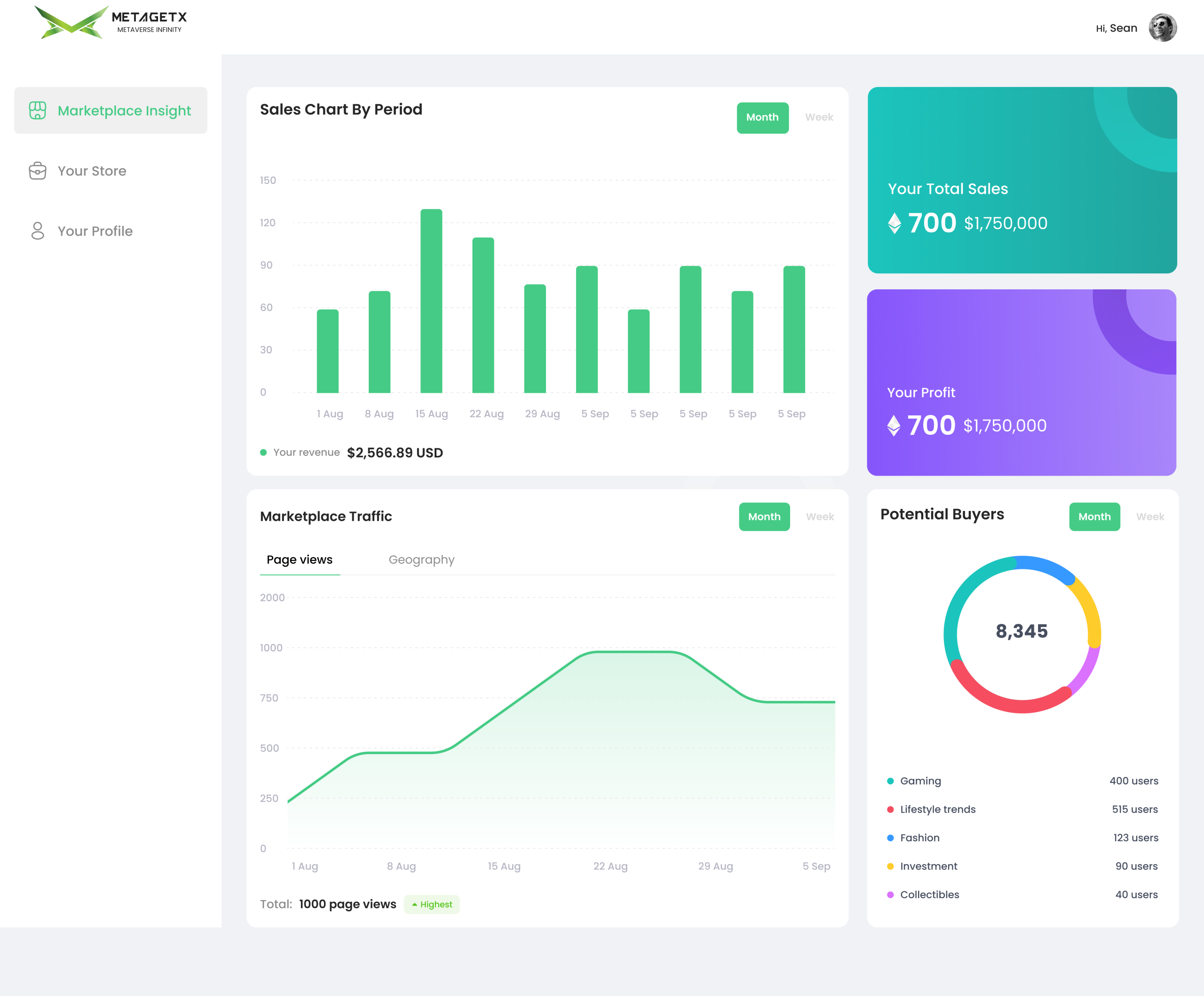
Creators and brand partners need visibility into how their NFTs perform. The Seller Dashboard surfaces Sales Charts by period, total revenue, profit breakdown, marketplace traffic trends, and a Potential Buyers breakdown by category — giving creators the data they need to plan future drops and optimize pricing strategy without needing a separate analytics tool.
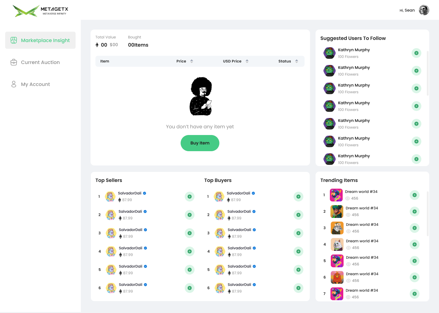
The Buyer Dashboard gives collectors a single view of their current auction activity, purchased items, and portfolio status. A live Top Sellers and Top Buyers leaderboard adds a social and competitive layer — rewarding active collectors with recognition. The Trending Items sidebar keeps buyers engaged with what's happening across the marketplace in real time.
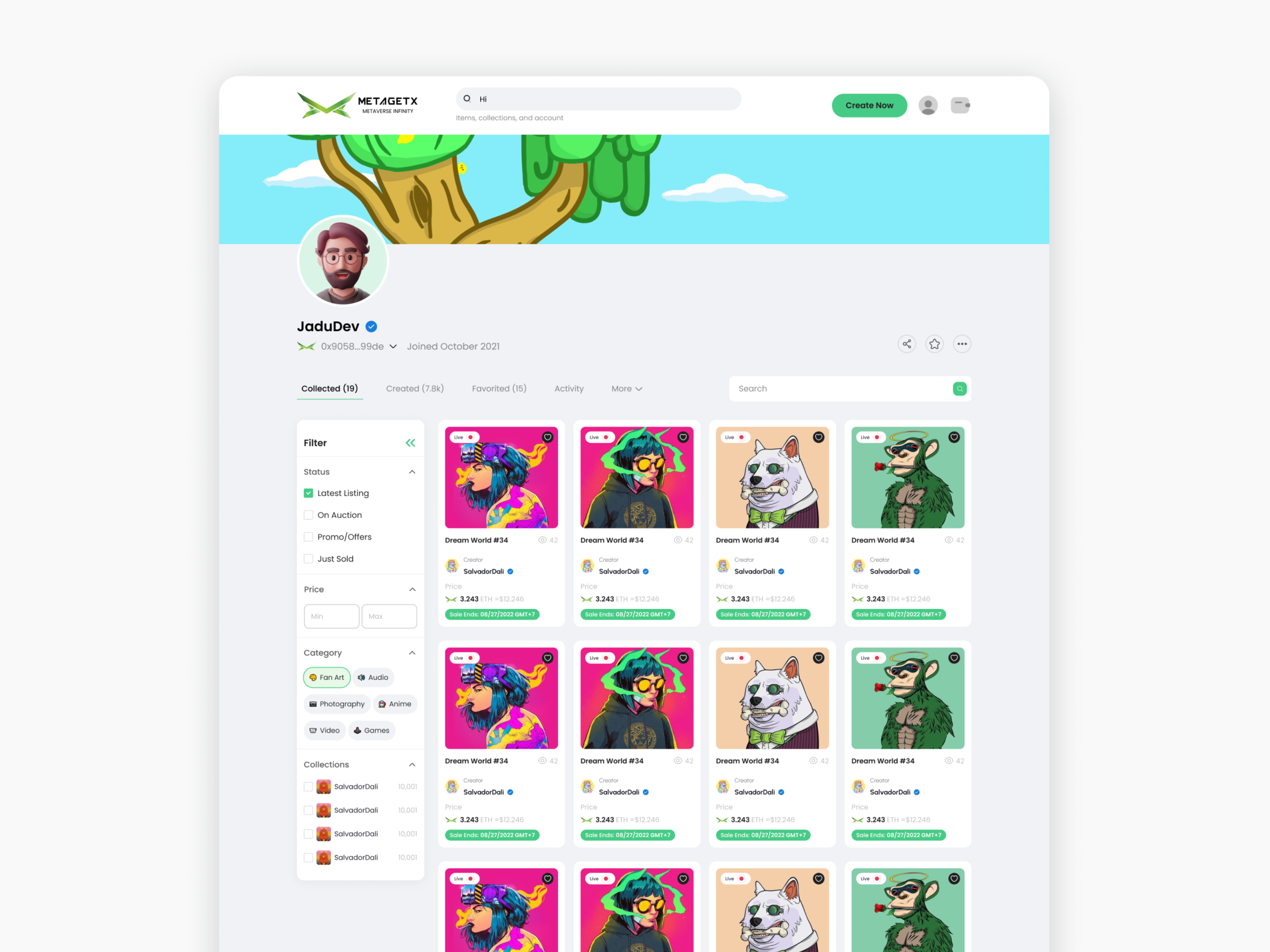
Each creator has a public profile page combining identity, verification status, and their full NFT collection in a filterable grid — sorted by Collected, Founded, Created, Activity, and Favorited. Category filters and collection groupings help buyers navigate large inventories quickly. This page functions as both a storefront and a social proof mechanism for creators building their reputation on the platform.
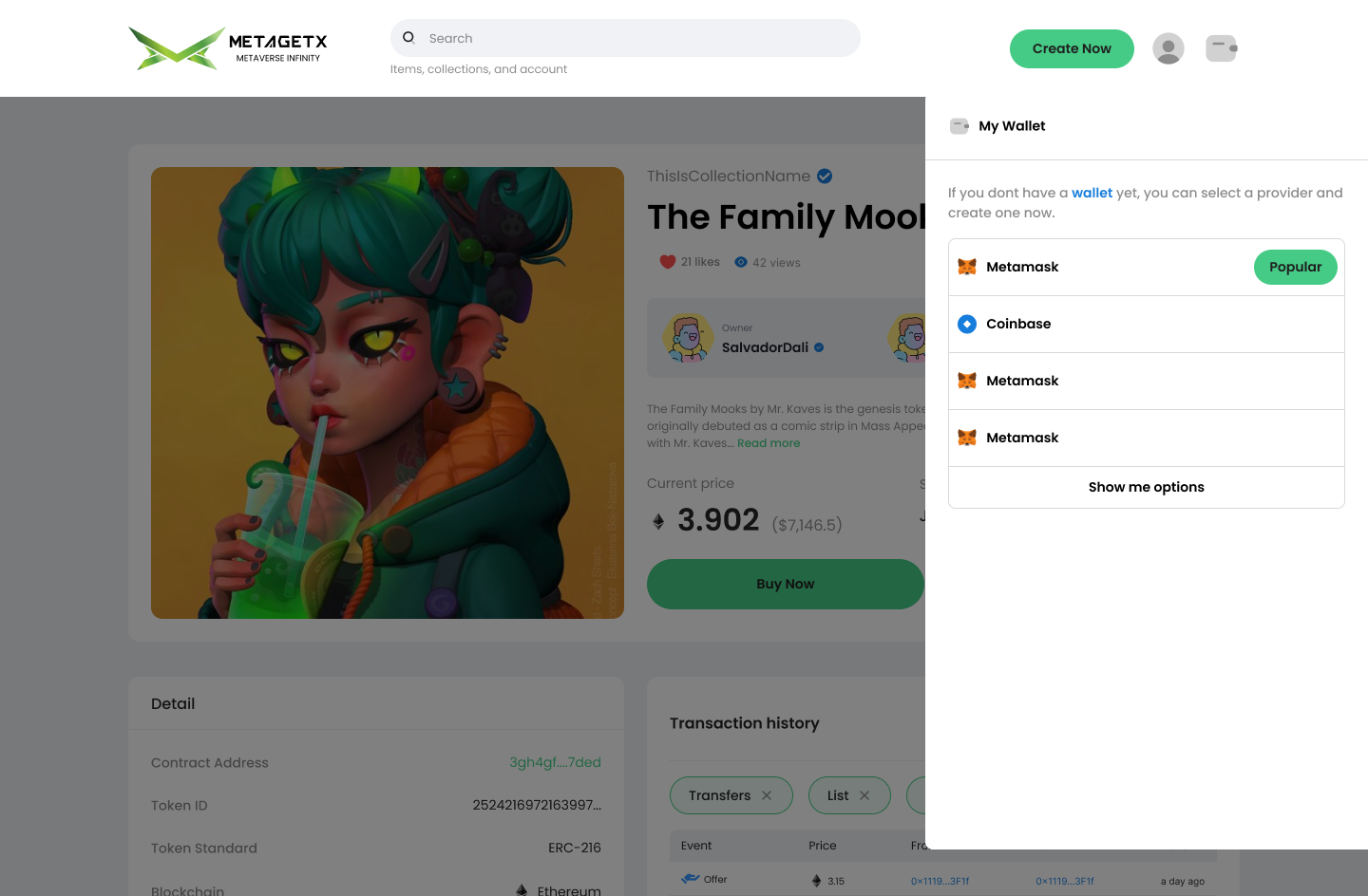
When a first-time buyer clicks "Buy Now," a wallet connection panel slides in rather than redirecting to a separate page — keeping the user in context. The panel guides users through selecting a wallet provider (MetaMask, Coinbase, and others) with clear labeling and a "Popular" badge to reduce decision paralysis. For users without a wallet, the prompt "If you don't have a wallet yet, you can select a provider and create one now" removes the feeling of being locked out — framing wallet creation as a natural next step rather than a prerequisite.
Making NFT ownership feel simple required alignment across product, engineering, and business — not just UI polish. The custodial wallet approach only worked because the whole team committed to abstracting complexity at every layer, not just the surface.
SEA users don't behave like the Western crypto audience that most Web3 design patterns were built for. Designing for Vietnam, Malaysia, and Singapore meant questioning every assumed pattern — from payment flow to trust signals to how "ownership" is communicated.
NFT market conditions changed rapidly throughout the project. Having a solid user research foundation meant we could adapt feature priority and messaging without losing sight of our core user needs — the fundamentals stayed stable even when the market didn't.
Bringing in recognizable brands wasn't just a growth tactic — it was a trust mechanism built directly into the product experience. The design had to reflect and reinforce that trust at every touchpoint, from creator verification to how brand NFTs were displayed and categorized.
Investing early in a consistent component library — tokens, card patterns, spacing rules — meant we could ship new features and brand drops without rebuilding UI from scratch each time. The system became the team's shared language for speed and consistency.
Forcing every design decision through the lens of a mobile thumb zone eliminated unnecessary complexity naturally. If something couldn't be made clear and tappable on a 375px screen, it usually meant the concept itself needed simplifying — not just the layout.
This project pushed me to design at the intersection of emerging technology and mainstream accessibility — one of the most challenging and rewarding spaces to work in. If you'd like to discuss the project or explore working together, feel free to reach out.