Platform
Redesign Turning a functional but fragmented recognition portal into a cohesive, brand-aligned experience — where celebrating great work feels as good as the gesture itself.
What wasn't working — and why
A systematic UX audit across 3 core screens of the existing e-Recognition system revealed 14 usability violations evaluated against Nielsen's 10 Heuristics. Issues were scored by severity to anchor the redesign scope in evidence, not opinion.
 1
2
3
4
1
2
3
4
White header strip and yellow branded area look like two separate products on the same URL. Users cannot identify this as one cohesive system at first glance.
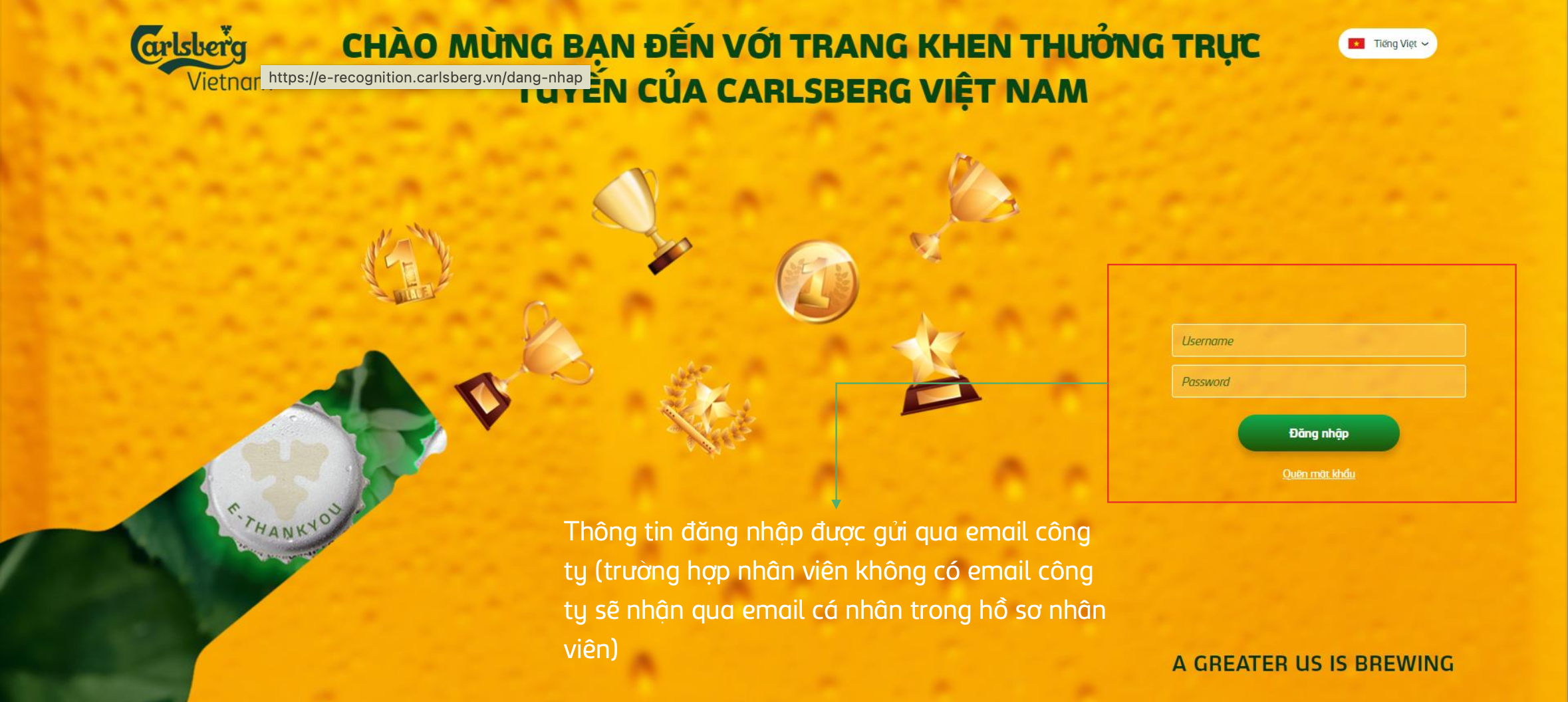
Consistency & standardsThe login form wrapped in a bold red border universally signals an error or validation failure — before the user has even touched the form. Creates false anxiety at first impression.
Visibility of system statusFloating trophy icons scatter visual attention across the entire screen. No hierarchy guides the eye to the login form. Eye-tracking would show extreme scatter on first glance.
Aesthetic & minimalist designInstructional paragraph on the yellow background estimated at ~2.8:1 contrast ratio — below the 4.5:1 WCAG AA minimum. Critical information about email delivery is effectively unreadable.
Visibility of system status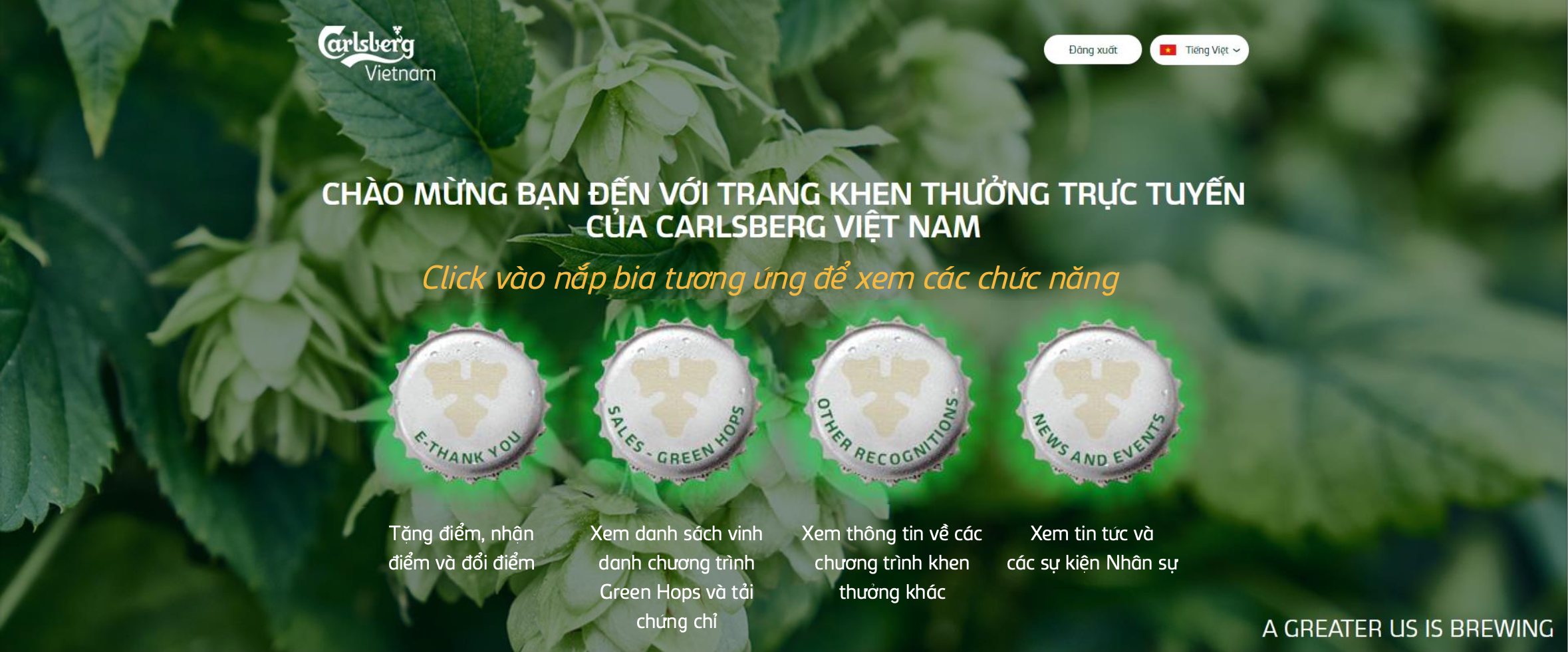 1
2
3
4
1
2
3
4
Beer cap icons as primary navigation have no standard affordance signaling "click me." New users must discover functionality through trial and error — violating learnability at the entry point.
Recognition over recallOnly 2 of 4 caps show a green glow effect — with no logic determining which. Users cannot tell if this is an active state, a notification indicator, or purely decorative animation.
Consistency & standardsLabel text (the only way to understand each section) is visually crushed by oversized cap images above it. The least important element dominates the screen; the most important is a footnote.
Aesthetic & minimalist designAfter navigating to any feature, returning requires a full homepage reload. Users rebuild mental context from scratch every time they switch tasks. This was the single most mentioned frustration in stakeholder interviews.
Visibility of system status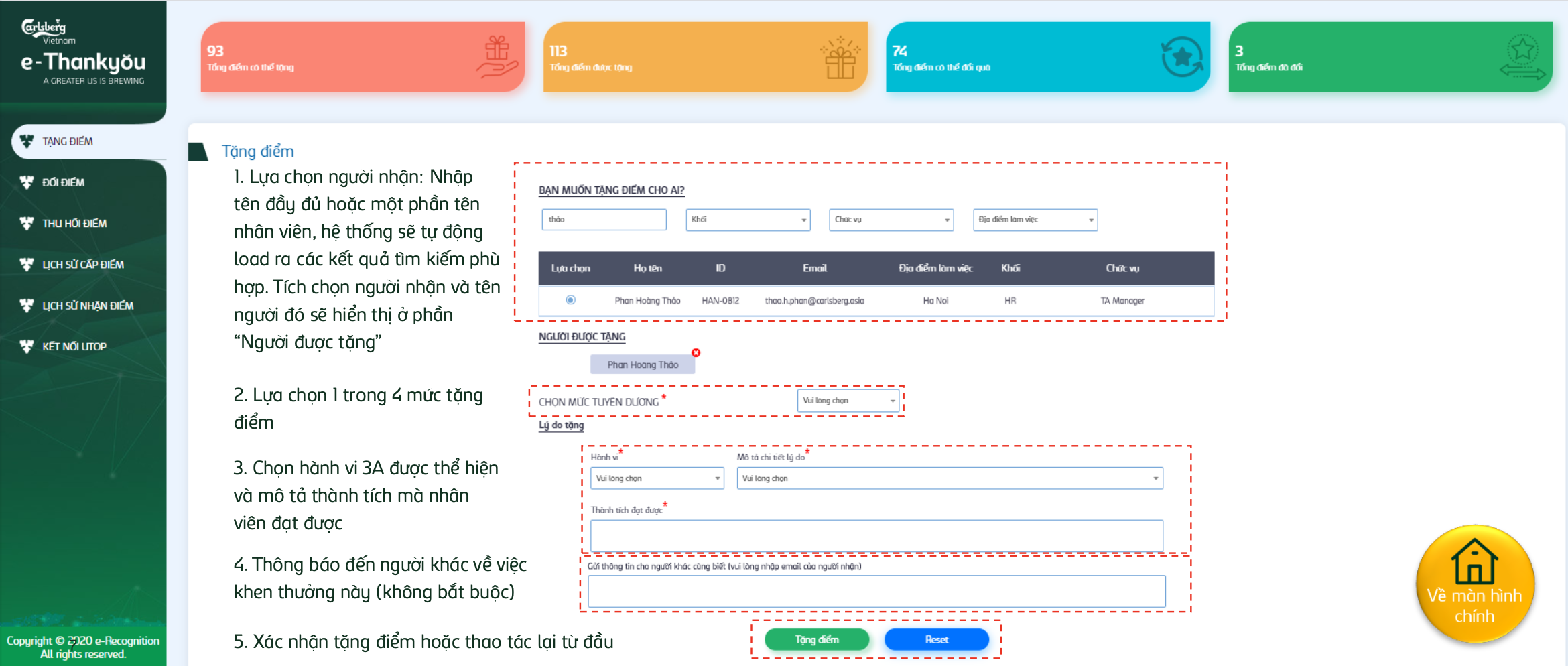 1
2
3
4
5
1
2
3
4
5
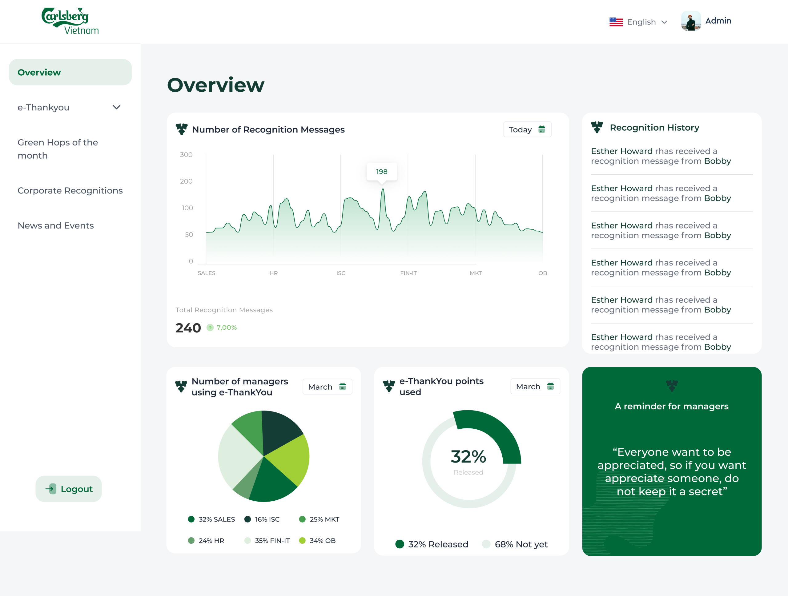
Pink, orange, teal, green — each card uses a completely different hue with no shared design token. The rainbow palette makes the dashboard look like 4 separate products, not 4 states of one data model.
Consistency & standardsForm sections outlined with red dashed CSS borders — identical to the debug style developers use during layout testing. Users associate red dashes with errors or broken states, not structured form sections.
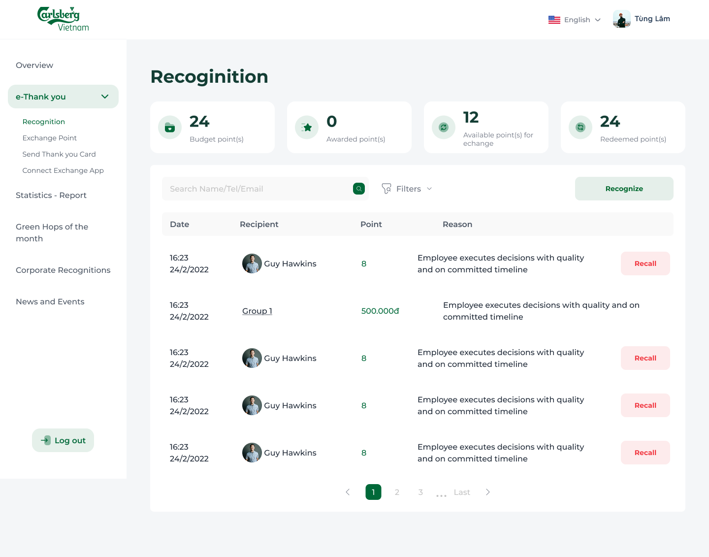
Match between system & real worldFor common Vietnamese surnames (Nguyen, Tran, Le), a name search returns 20+ results. Managers must visually scan by email and location — leading to wrong-recipient selections that require the cancellation function to undo.
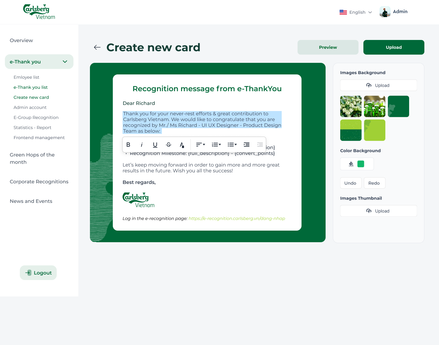
Recognition over recallThe "Behavior" dropdown lists Triple A codes with zero explanation. Managers must already know what each code represents. No tooltip, no popover, no inline help — the most important field in the form is the least explained.
Recognition over recall"Copyright © 2020 e-Recognition" placed inside the primary navigation sidebar — occupying real estate that belongs to wayfinding. Legal boilerplate should never compete with nav items for vertical space.
Aesthetic & minimalist designThese weren't random issues — they pointed to one root problem
The audit revealed a system built without a design system, without user testing, and without adherence to Carlsberg brand guidelines. Every screen was designed in isolation, producing a fragmented experience at every touchpoint.
No persistent navigation
Every module switch forced a full homepage exit. Users rebuilt mental context from scratch on every task — confirmed by the journey map "Find" stage drop-off.
No design system or token structure
Colors, typography, and components were all ad-hoc. The same "error red" used for decoration (login border, dashed form boxes) eroded user trust at core interaction moments.
Search limited to name-only lookup
With no email or department filter, common Vietnamese names returned 20+ results — the direct cause of wrong-recipient errors and the most requested improvement from stakeholders.
Recognition locked behind budget points
Non-managers had zero way to express recognition — a structural gap leaving 70% of the organization unable to participate in the culture program the e-Card feature was designed to close.
Recognition Principles the system failed to surface
The system was built around Carlsberg's "Triple A" behaviors. The redesign needed to surface these at the moment of recognition — not bury them in unlabeled dropdowns.
- Brings breakthrough contribution to the organization
- Work result exceeds expected outcomes
- Supports colleagues beyond their own job scope
- Overcomes difficulties with strong effort
- Proposes creative and practical improvement ideas
- Properly applies Triple A principles in daily work
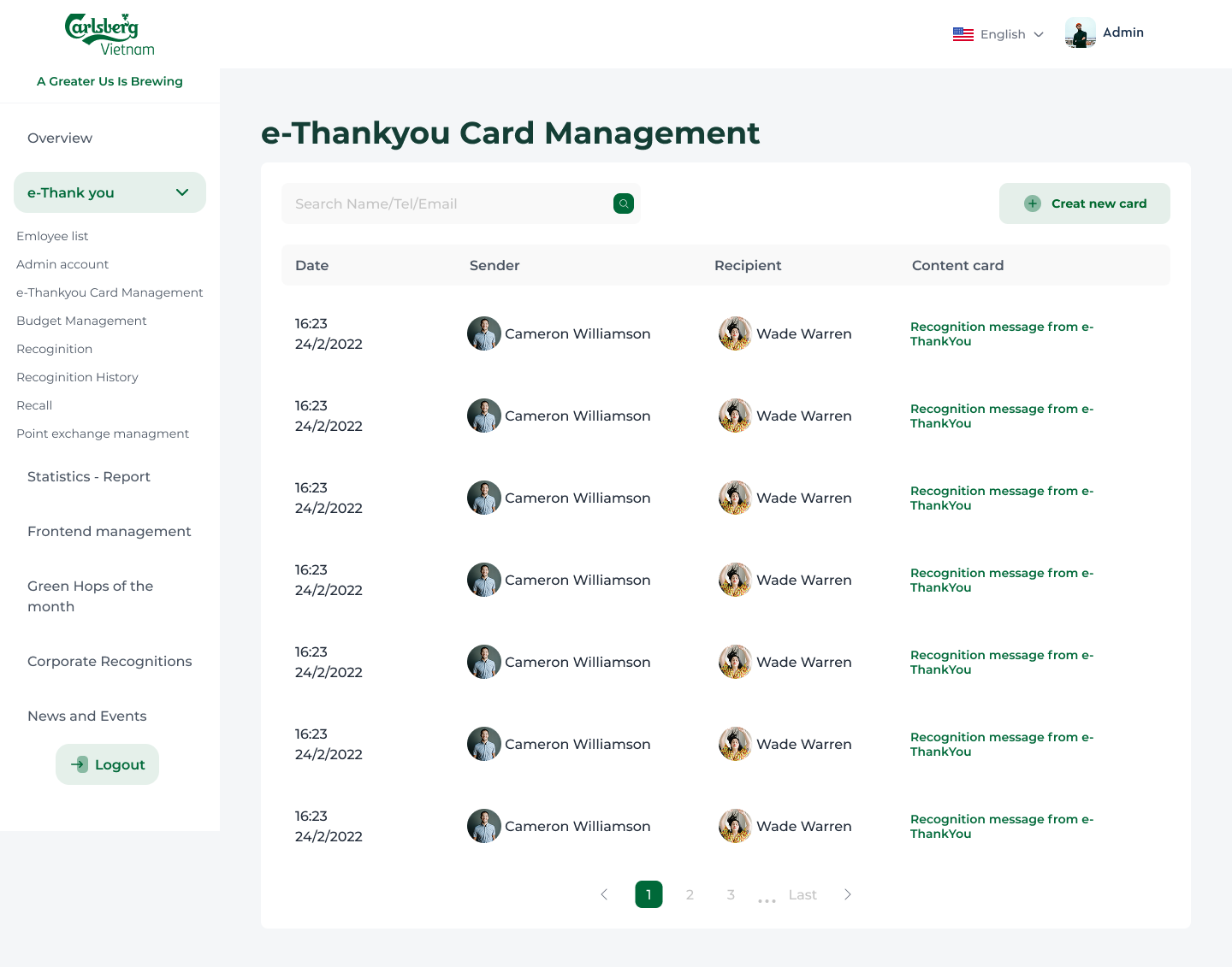
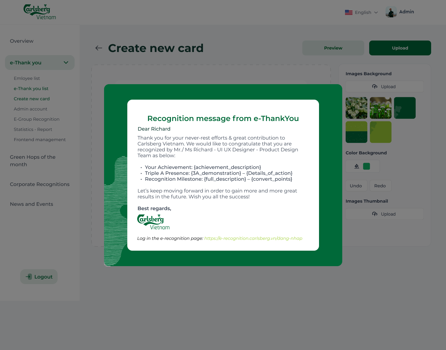
From concept to high-fidelity
7 screens across the admin portal — a unified, data-rich workspace with new tools built directly from user needs uncovered in the audit and research phase.
Designed for every device — recognition on the go
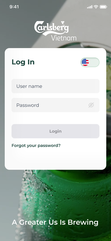
The platform was designed mobile-first for frontline employees and sales teams who primarily access the system via smartphone. All core flows — recognizing, receiving, and redeeming points — work fully on mobile.
Single-column stacked layout
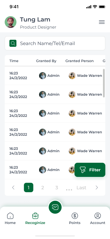
All multi-column grids collapse to a single scrollable column on screens below 768px — no horizontal overflow, no clipped content.
Touch-optimized tap targets
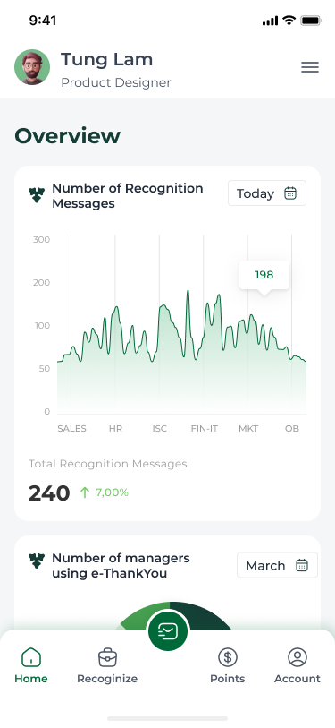
All interactive elements meet the 44×44px minimum touch target size. Navigation sidebar collapses to a bottom tab bar on mobile for one-thumb reachability.
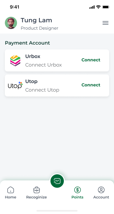
UTOP redemption — mobile only
Point spending via the UTOP partner app is intentionally mobile-exclusive — the redemption flow deep-links directly into the UTOP app on iOS and Android.
iOS & Android
Full feature parity across both platforms via responsive web app — no separate native app required.
UTOP mobile-exclusive
Point redemption and spending is intentionally restricted to mobile — incentivising app adoption across the workforce.
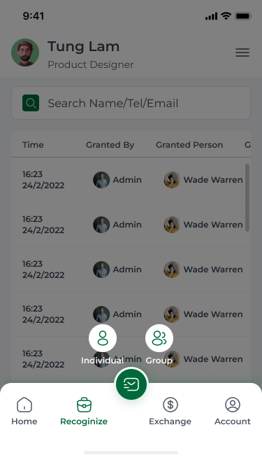
Bottom tab navigation
Persistent sidebar collapses to a bottom tab bar on mobile — all 4 modules reachable with one thumb, no scroll required.